Peak Healthcare
Is an easy to use database built for providers in a local healthcare system.
Role
Lead UX Designer/Researcher
TLDR:
Timeline
Jan 2026 - Aug 2026
Tool
Figma
To create a simple, easy to use database that providers could use from multiple locations. As a Lead UX Designer/Researcher, I explored user flows that coincided with the needs of healthcare professionals and developed a cohesive brand identity to package the product.
Solution
Scheduling, resources, and records all in one place.
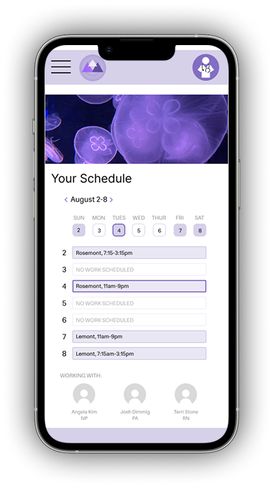
A scheduling hub makes it easy to see when you’re working, who you’re working with, and which location you’re at.
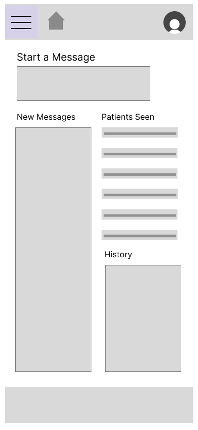
Whether you need to reach out to a patient or a colleague, our messaging portal is at your fingertips.
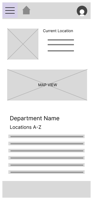
The location page gives you a guide to where you could be scheduled.
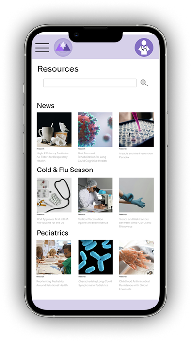
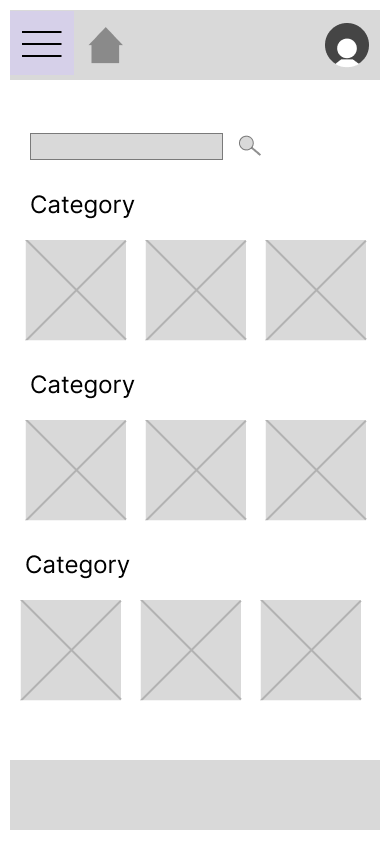
Having resources at your fingertips makes brushing up on your knowledge and staying up to date easier than ever.
The Prompt
‘Design an app where practitioners can see their schedule, communicate with patients, and reference records.’
While patient-facing healthcare apps continue to improve in design and function, I noticed that providers don’t get the same courtesy.
Functionality remains top priority in the healthcare field, but it’s clear that beautiful design is often overlooked.
I knew that those two things aren’t mutually exclusive - that’s why I set out to create a functional, well-designed app for practitioners.
Research
What do practitioners actually use?
Not being a practitioner myself (and not having access to database flows due to HIPPA rules), I had to go off of verbal accounts and existing client-facing health forums.
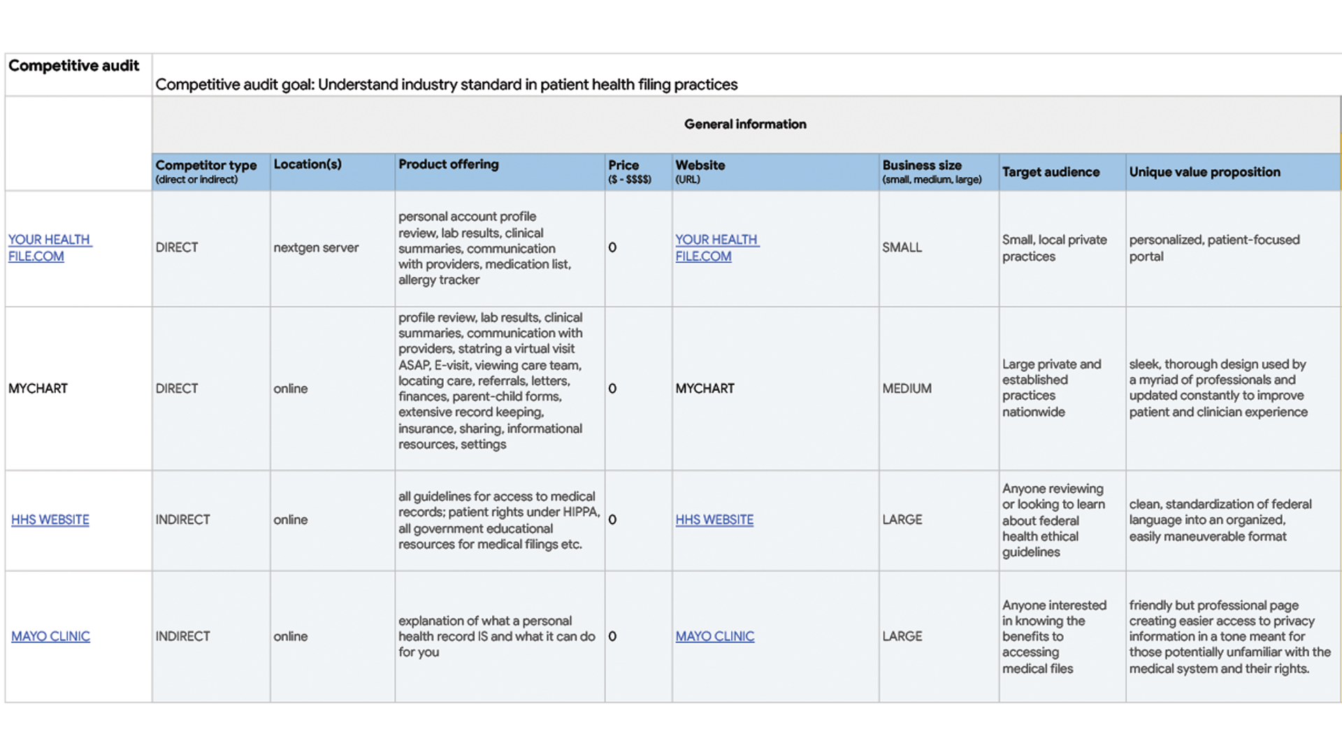
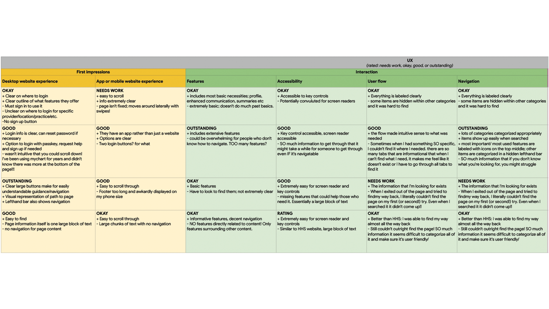
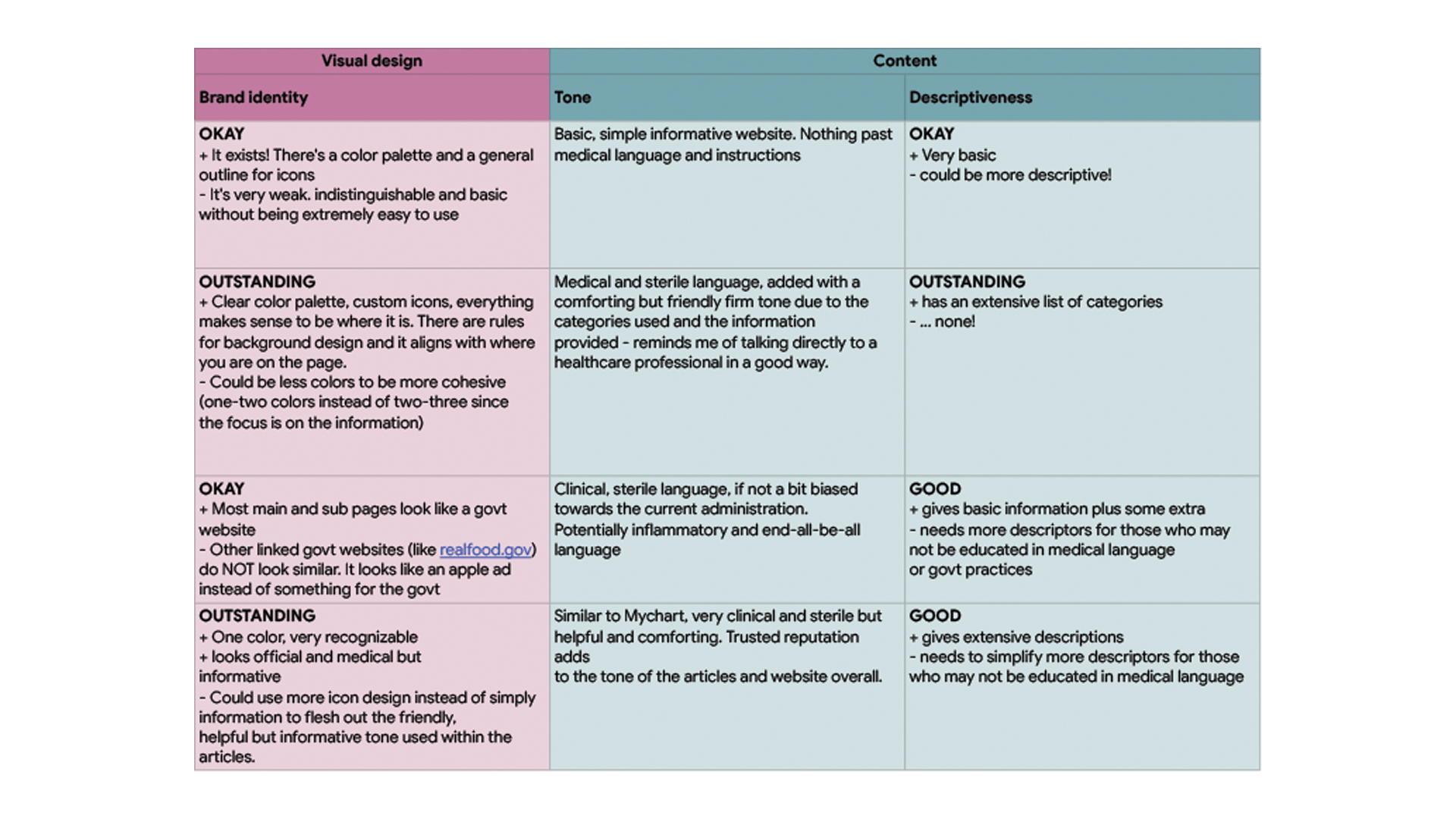
I ran a competitive audit comparing government websites, patient-focused forums, and general health-related sites.
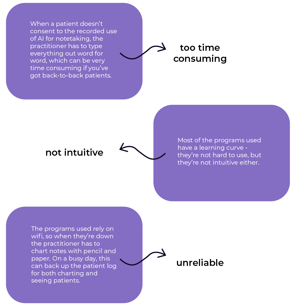
After interviewing healthcare practitioners of different backgrounds, these are the frustrations I came to:
Ideation
To the drawing board!
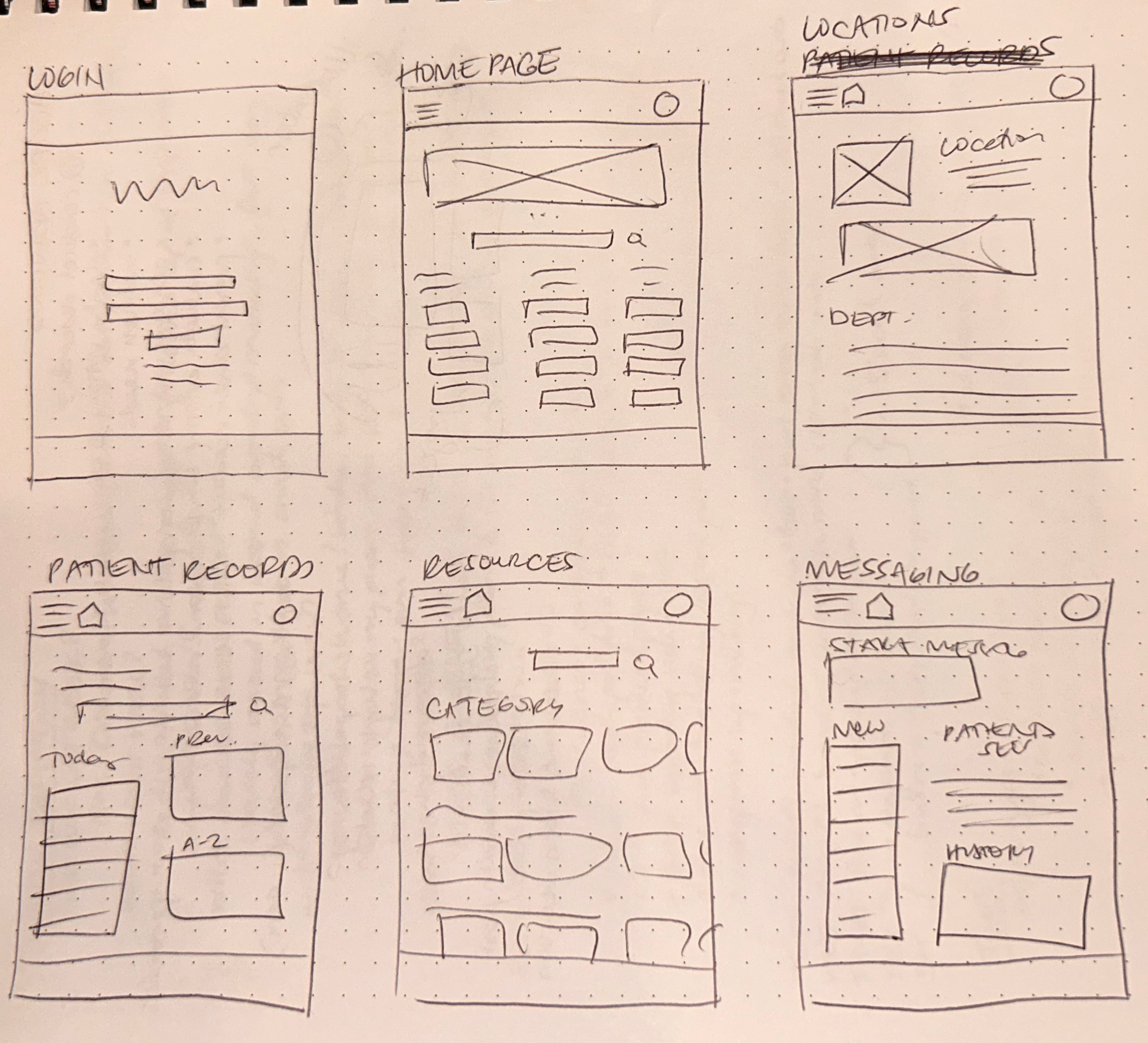
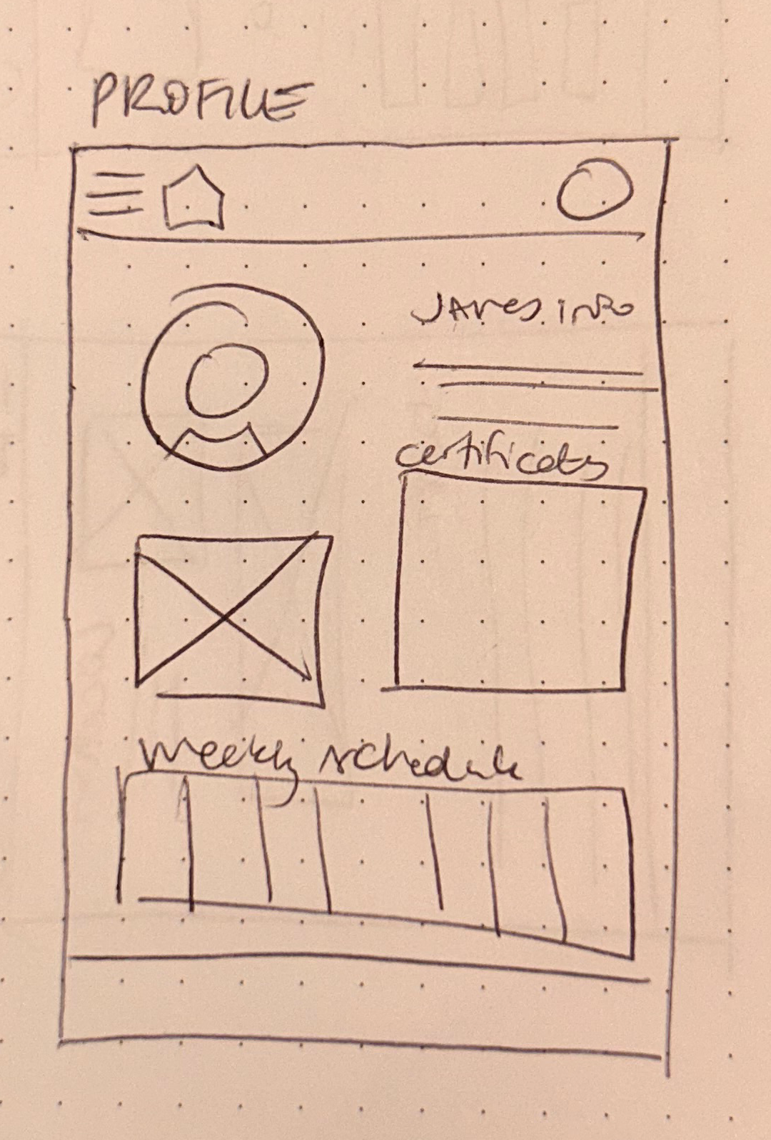
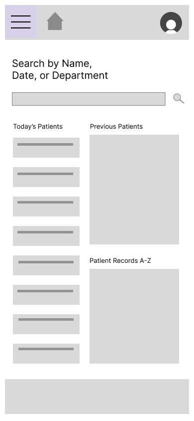
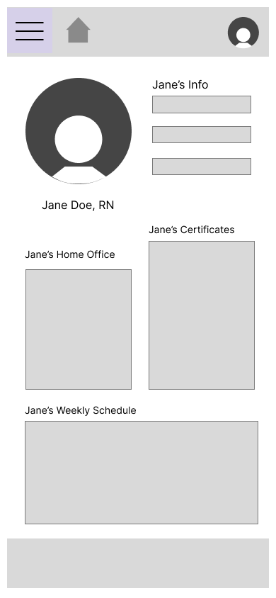
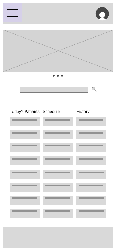
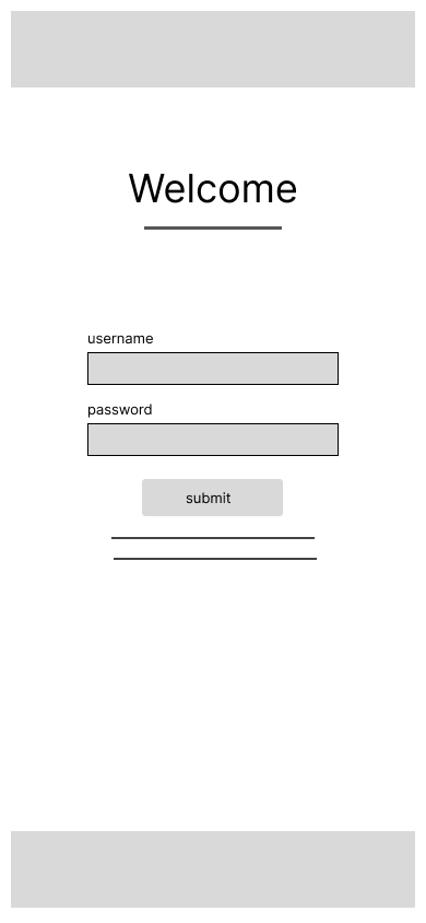
Low fidelity wireframes
let me sketch layouts quickly while keeping the core message at the forefront.
Showcase
What did users think?
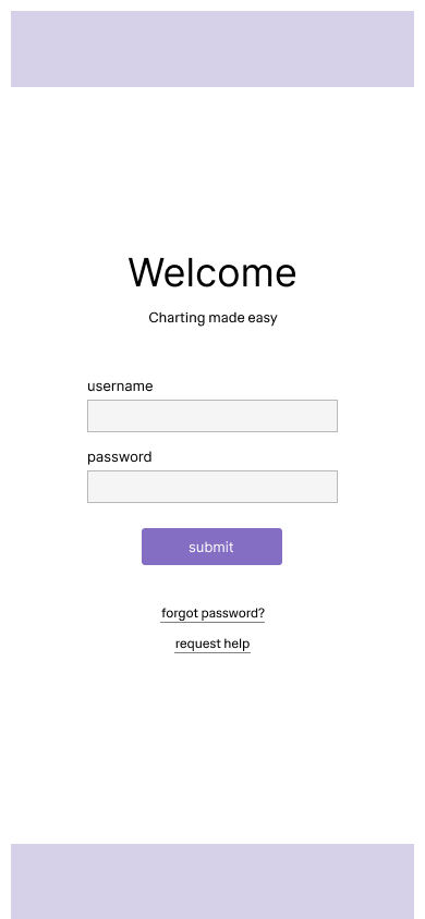
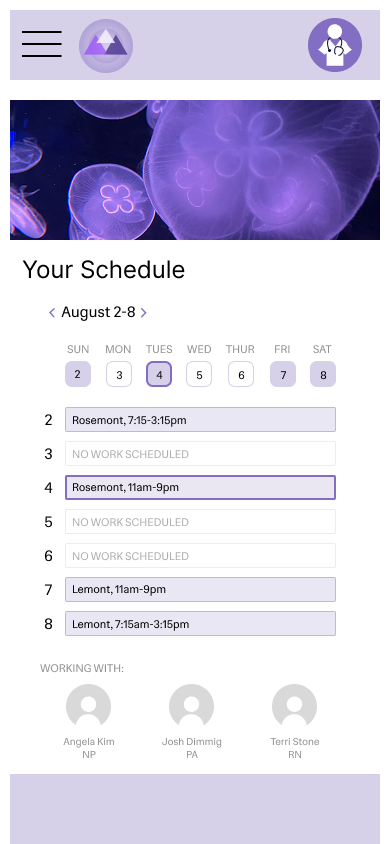
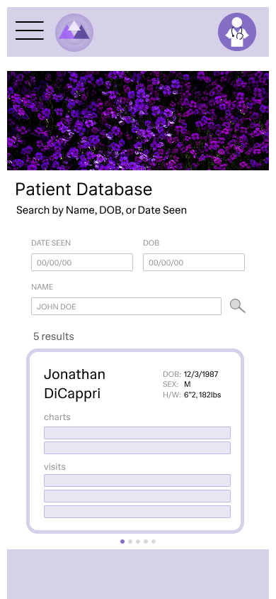
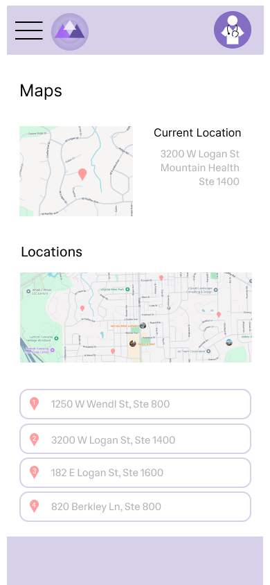
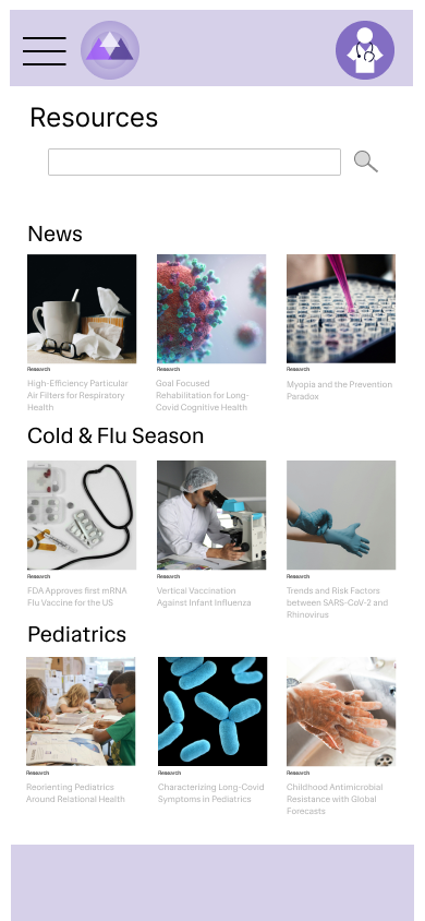
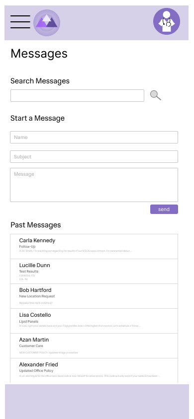
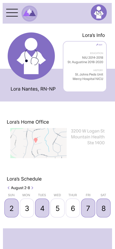
Providers enjoyed the scheduling page, maps function, and resources section. The messaging page is functional and users liked being able to see their schedule in their profile page. People found the home page to be a bit bare in terms of being an app hub - in the next iteration, I would create a more diverse home page and leave scheduling to be a separate page.